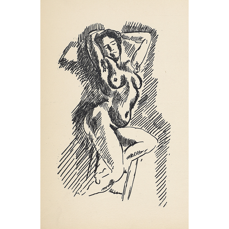
As one grows older, books tend to shrink in size. Pages become smaller, the type more dense. Illustrations fall away, as though the once helpful art now runs the risk of interference.
Late last year, Dr. John Bidwell, curator of the Morgan’s exhibition Graphic Passion: Matisse and the Book Arts, challenged the notion that illustrated texts are only for children. The exhibition takes as its premise Matisse’s early fasciation with the printed word. The artist shared an esprit de corps with writers of the Paris avant-garde, including Pierre Reverdy, Stéphane Mallarmé, and Charles Baudelaire. Some of Matisse’s first commissions, in fact, came from authors asking him for illustrations.
Matisse’s passion for graphic design lives on in the objects on view at the Morgan, from book covers to book pages, dog-eared sketches to pristine lithographs, pencil drawings to colored shapes, and finally, to his boldly hued scissorworks. “This is the first exhibition anywhere to look at Matisse as not just as an artist-illustrator,” says Bidwell, “but as an artist who looked at book production every step of the way—design, layout, typography, lettering, calligraphy, covers—all of it.”
The more authors Matisse worked with books, the more he understood how to manipulate them into interactive pieces of art. If the words were telling a story, then so were the pictures. For every typeset letter that had to fit on the page, there was an equally important, equally evocative swoop of illustration.
Matisse revolutionized the concepts of illustration and book art, but not without the aid of the poets and writers who also believed in transcending genre and experimenting with the book as an art form.
Matisse revolutionized the concept of illustration and book art, but not without the aid of the poets and writers who also believed in transcending genre and experimenting with the book as an art form. Stéphane Mallarmé, whose work is referenced in the exhibit, famously said: “Everything in the world exists in order to end up as a book.” Bidwell points to a blank notebook into which Matisse has cut and pasted text from Mallarmé’s Poésies.
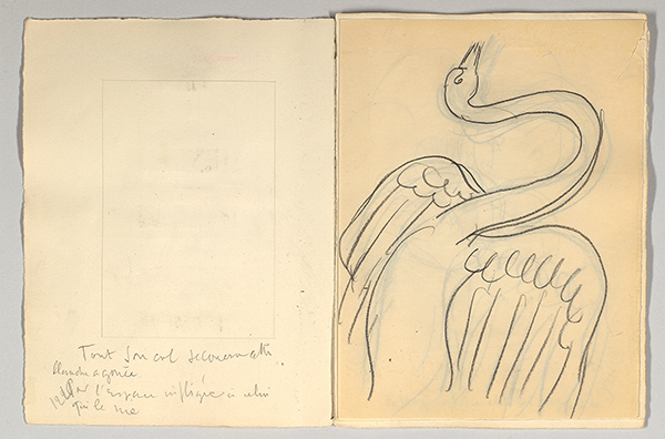
for Stéphane Mallarmé, Poésies, 1932. Collection of The Pierre and Tana Matisse Foundation © 2015 Succession H. Matisse / Artists Rights Society (ARS), New York. Photography by Graham S. Haber, 2015.
It wasn’t enough for Matisse to know the general story or themes of a book he was illustrating. Studying the words on each page allowed Matisse to grasp their nuances and decipher the author’s choices. He wanted to supplement the book with images that were fundamental, not superficial, to the text. “Matisse felt that illustrations should not be subservient to the text,” Bidwell explains. “The designs should be on a parallel track; actually depicting incidents, characters, [and] scenery was a disservice both to the artist and to the author, because the artist’s work should have its own merit, and a literary work should not need pictures for explication. It should be able to stand on its own merits.”
Matisse, like Mallarmé, also admired the French poet Charles Baudelaire, whose collection Les Fleurs du mal (The Flowers of Evil) sits in a case on the other side of the exhibit. In his poem “Le Soleil” (“The Sun”), Baudelaire writes:
Fencing with rhymes, which, parrying nimbly, back away;
Tripping on words, as on rough paving in the street,
Or bumping into verses I long had dreamed to meet.
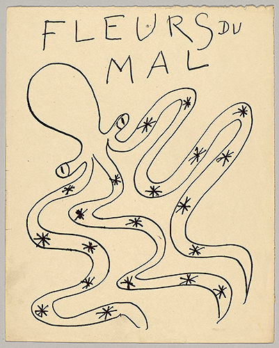
While illustrating Mallarmé’s work, Matisse sketched images that extended all the way to the edge of the page, which had consequences in the printing and binding of the book. Bidwell gestures to an original Mallarmé, “a pristine copy in the original wrappers,” whose then-owner had the book rebound to match the other classics in his collection. The binder, Bidwell says, “didn’t realize Matisse’s program and trimmed the book, so, not in this opening, but in some other openings, you are actually missing little bits of Matisse! That’s what you get when you break the rules.”
With each of his illustration projects, Matisse was also training himself in typography. According to Bidwell, Matisse stood alongside the printers as they deliberated about type and typographical revisions for Poésies. “He felt it was so important that the weight of the illustration balance the weight of the type. He used the metaphor of a juggler with a black and white ball, juggling them so adroitly that you couldn’t see the difference.”
Just as Matisse was redefining how art can sit on the page, so had Joyce revolutionized how a story should be told.
And yet, when it came to illustrating the notorious Ulysses in 1935, Matisse did not honor the text as much as he had on earlier projects with writers; he did not even read Joyce’s work, because there was no French translation, and referred instead to The Odyssey for his artistic inspiration. The cases containing his sketches for Ulysses include a letter Joyce wrote to his son explaining his concept for the illustrations and asking him to intercede with the publisher. But despite Joyce’s displeasure, the juxtaposition of Matisse’s visual creativity with Joyce’s textual originality cannot go unnoticed. Just as Matisse was seeking tacit connections between text and illustration, so too was Joyce seeking tacit understanding between narrator and reader. Just as Matisse was redefining how art can sit on the page, so had Joyce revolutionized how a story should be told.
Did Matisse’s images need to correspond to the words? Did Joyce’s words need to correspond to meaning? Didn’t Matisse want to dazzle his audiences; didn’t Joyce want to confound his readers?
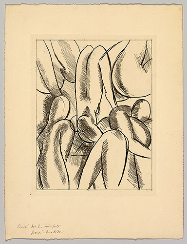
“The whole point of [Matisse’s] style of illustration is not a mimetic one-to-one correspondence, but an expression of kindred spirit [between artist and author],” Bidwell says. The Morgan’s exhibit has cleverly applied that principle to the room at large. Mallarmé, Joyce, Baudelaire—who themselves experimented with poetry and prose, who channeled childlike, brazen impulses to break rules and boundaries, who created new kinds of art for readers—these were kindred spirits of Matisse.

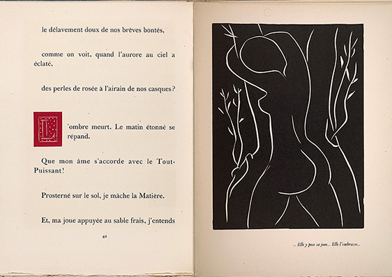
![Montherlant, Henry de, 1896-1972. Pasiphae : Chant de Minos (Les Cretois) / [Paris] : Martin Fabiani, [1944], p. 42 and facing lihtograph (stitched together), PML 195598 Montherlant, Henry de, 1896-1972. Pasiphae : Chant de Minos (Les Cretois) / [Paris] : Martin Fabiani, [1944], p. 42 and facing lihtograph (stitched together), PML 195598](https://www.guernicamag.com/wp-content/uploads/2016/04/6-pasiphae-chant-de-minos-les-cretois_800.jpg)
![Charles, d’Orleans, 1394-1465. Poemes / de Charles d’Orleans ; manuscrits et illustres par Henri Matisse[Paris] : Teriade editeur, [1950] PML 195613, frontispiece and title page (stitched together) Charles, d’Orleans, 1394-1465. Poemes / de Charles d’Orleans ; manuscrits et illustres par Henri Matisse[Paris] : Teriade editeur, [1950] PML 195613, frontispiece and title page (stitched together)](https://www.guernicamag.com/wp-content/uploads/2016/04/14-frontispiece-and-title-page-poemes-de-charles-dorleans_800.jpg)
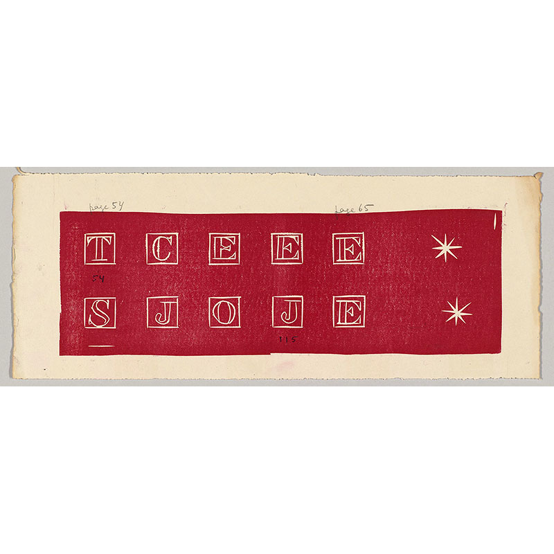
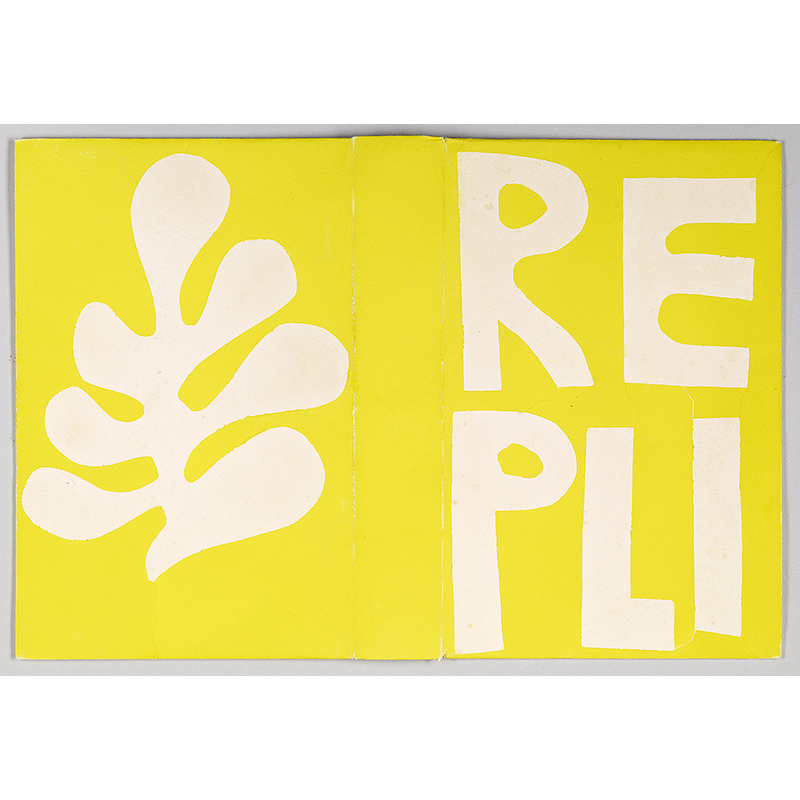
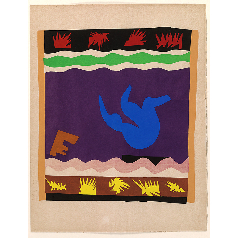

![Matisse, Henri, 1869-1954. Le Cirque (Jazz, pl. II) [Paris : Teriade, 1947] 2007.77b Matisse, Henri, 1869-1954. Le Cirque (Jazz, pl. II) [Paris : Teriade, 1947] 2007.77b](https://www.guernicamag.com/wp-content/uploads/2016/04/10-circus-pochoir-plate-ii-in-jazz_800.jpg)
![Matisse, Henri, 1869-1954. Dessins : themes et variations / [Paris] : Martin Fabiani, 1943. Frontispiece and Title Page, stitched together PML 195596 Matisse, Henri, 1869-1954. Dessins : themes et variations / [Paris] : Martin Fabiani, 1943. Frontispiece and Title Page, stitched together PML 195596](https://www.guernicamag.com/wp-content/uploads/2016/04/7-dessins-themes-et-variations-precedes_800.jpg)
