The Pratt Manhattan Gallery showcases design that’s meant to disrupt.
By Haniya Rae
Want to start a movement? Design a poster.
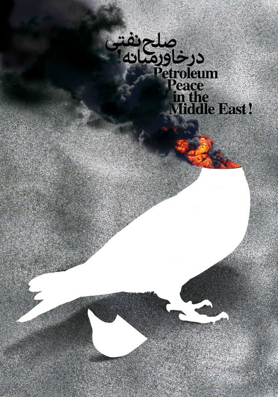
The Pratt Manhattan Gallery’s current show, Graphic Advocacy: International Posters for the Digital Age 2001–2012, displays some 122 posters created with the intention to inform citizens of larger cultural issues. Curator Elizabeth Resnick, who’s been organizing design exhibitions since the early 1990s, explains that these posters are essentially “dissent made visible,” and are designed to “communicate, advocate, instruct, celebrate, and warn” while pushing viewers to take action through their bold typography and graphics. The collection of posters address Occupy Wall Street, the Fukushima disaster, global warming, and many other cultural uprisings and atrocities from the past decade.
Grégoire Vion’s “For the Occupiers” features eight multi-colored arms in a wheel around a central star. Only four colors are used to section apart the design, creating stark contrasts between letters, hands, and shapes within the image. Yet, the arms and hands are locked together and intertwined to create the wheel. “I do not point to a solution, nor to an enemy; what I support is communal expression and a sense of shared responsibility,” states Vion in his explanation for creating the poster. Vion’s stance doesn’t necessarily come through, however. The interlocked arms surely bring to mind the diverse group of early protestors at Zuccotti park, though the word “occupy” protruding from the circle reads more as a call to action against the Wall Street financial district.
Lucas Krull’s “Support Japan” is part of a larger set of posters that urged viewers to support Japan after the March 2011 earthquake. The large red circle is the only element, like the Japanese flag. Yet the circle has been made by dropping red ink onto a wet paper, diffusing what would be a crisp circle into a wash that bleeds through the paper. What would be a graphic flag symbol has become a visual metaphor for the tsunami’s destruction of Japan.
Looking at the image, the immediate sensation is one of drowning. The figure is trapped, with no visual space to move around in, and no escape—no land—in sight.
“Global Warming” by Leo Lin features a white human body mostly submerged below water. Only the forehead, nose, lips, and chin peak above the water level. “Increasing temperatures result in rising sea levels with potentially catastrophic consequences for low-lying shore communities,” Lin writes in his explanation for the poster. “Some island nations will be submerged if the sea level continues to rise.” When looking at the image, the immediate sensation is one of drowning, of gasping for air. The figure is trapped, with no visual space to move around in, and no escape—no land—in sight.
Each poster stands on its own, regardless of whether a similar message is displayed next to it. Two posters, such as Asher Jay’s “Dolphin Drip Disaster” and Anthony Burrill’s “Oil & Water Do Not Mix,” protest the 2010 Deepwater Horizon oil spill in the Gulf of Mexico, though Jay’s comments directly on British Petroleum’s crimes against marine life while Burrill has repurposed the oil from the spill into a warning message. Both posters creatively deal with the issue, even though one is narrative and the other is utilitarian. Jay’s “Dolphin Drip Disaster” addresses the spill by graphically depicting the event with black curved marks and dolphin shapes jumping away from a rig, essentially recording the disaster with a visual medium. Burrill’s team actually gathered oil from the spill site and used it as silkscreen ink on their prints as a way to help clean the Gulf.
What’s interesting is that while not all of the posters in the collection were mass-produced (Lucas Krull’s prints were a handmade edition of 100, and others, like Anthony Burrill’s, were silkscreened and sold as limited edition prints to support the Coalition to Restore Coastal Louisiana), they were created for the sole purpose of gaining a following and/or aid from the audience. Many of these posters live both physically and digitally, so that while only a few survive materially, the message carries on through the Internet. For any movement to be successful, whether it advocates for civil rights and liberties or rallies for aid money to ravished countries—strong images must immediately capture the audience’s attention, and carry across multiple platforms, digital or not.
“Graphic Advocacy: International Posters for the Digital Age 2001–2012,” will remain open at the Pratt Manhattan Gallery until August 28th, 2013.
Haniya Rae is Guernica‘s assistant art editor. She graduated summa cum laude from the Maryland Institute College of Art where she studied Painting and Art History. Her work has been published in Art in America:Drawing and she was awarded a France-Merrick Fellowship for her work in community arts.

